07 Jan 2010
Out and about over the holiday period I snapped these lovely pics on my mobile phone.
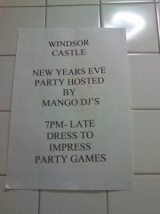
 You know those posters that people make which have loads or ClipArt, WordArt and about six different colours? This isn’t one of them. This ‘poster’ was stuck to the ladies’ loo wall of a pub in Battersea, where I was watching the footie last week.
Times New Roman. All caps. 48 point. Job done. Oh and don’t forget to dress to impress. Classy.
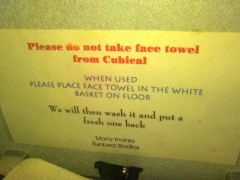
 This one was was spotted in my local sunbed salon. What I particularly like is that Cubical [sic] has been given a capital letter. Like it’s Cuba or something.
Extra points are awarded, though, for four different typefaces and three different colours.
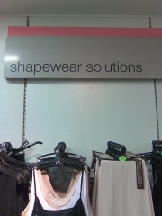
 Just how much do I hate the word solutions? Come on M&S you can do better than this.
How about ‘body contour pants’ or ‘slimming knickers’ or ‘fat-busting undies’. Anything is better than ‘shapewear solutions’.
(Oh and just for the record I was passing through this department on my way to the returns section, before you start getting any ideas!)
Got any pics you want to share? Email then over and I’ll put them up.


Andrew Nattan
Posted at 11:46h, 08 JanuaryThere’s nothing more pathetic and heart-rending than the A4 word processed flyer. Although youve not seen the WordArt and ClipArt monstrosities that haunt places near me.
I’ll keep my eye out for a picture!